
Photo: Johns Hopkins University
Johns Hopkins coronavirus map adds local data
16 April 2020
by Jonathan Andrews
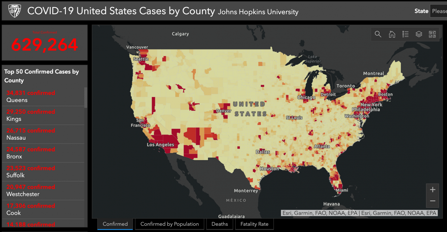
A global map that tracks coronavirus cases now includes data broken down to include every US county.
The world version, produced by Johns Hopkins University, includes confirmed cases by country and has become a trusted resource for tracking cases of COVID-19, fatalities, recoveries, and other data, since its launch in January.
Beth Blauer, Executive Director of the Johns Hopkins University Centers for Civic Impact, said the new localised maps will give an “incredible opportunity to start to really zoom in and understand the impact that COVID-19 is having at a very local level”.
She said it will help make public researchers, concerned citizens, policymakers, the media, and others gain better insights and track the COVID-19 pandemic.
The map, and its county status reports, are not drawn from new proprietary data but instead compile publicly available data and will be updated once a day.
“Our goal is to make this data as publicly and widely available as possible to help inform reporting and ongoing conversations and decision making about COVID-19 in the United States,” said Dr Lainie Rutkow, professor at the Johns Hopkins Bloomberg School of Public Health, during the press briefing.
Additional data for each county includes the density of the outbreak, localised stay-at-home policies, race and ethnicity, poverty rate, health insurance type, number of residents, and hospital capacity, among others.
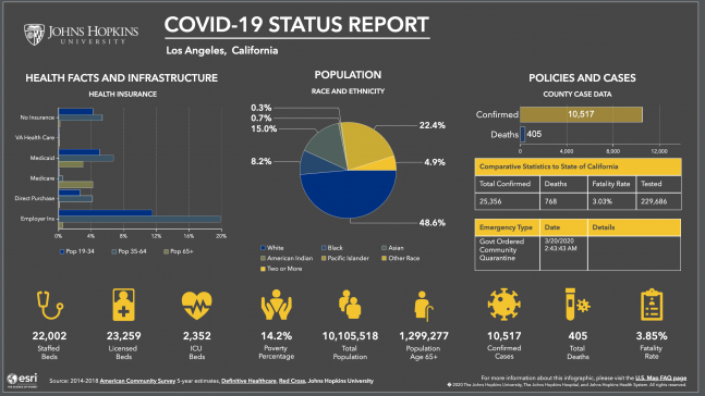
Jennifer Nuzzo, senior scholar at the Johns Hopkins Center for Health Security, said the county level data gives a much more nuanced understanding of the cases, hospitalisations and deaths that are occurring.
“We can then more appropriately identify areas where an increased transmission is happening, and try to understand what resources may be needed in order to mitigate the impacts of these infections,” she said.
“[This is] really the whole purpose of collecting data in the first place. We want this data so that we can know better how to act.”
Blauer added that it has been a continual learning process compiling the new data and figuring out on an ongoing basis how to provide new insights.
“[That is] really critical for those decision makers in the field who are having to make the tough calls every day and provide information to their local communities.”
The new map has been created and maintained by the teams from the Johns Hopkins Centers for Civic Impact, the Whiting School of Engineering, the Applied Physics Laboratory, and the Bloomberg School of Public Health. Technical and mapping support is powered by the JHU Sheridan Libraries, and ESRI.